Microsoft Excel Posts & Guides
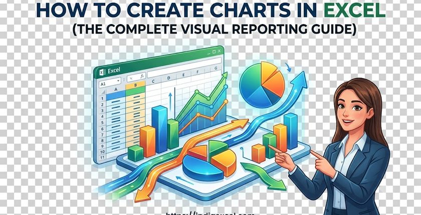
Create Charts in Excel (The Complete Visual Reporting Guide)
Previous post: How to Create and Edit Custom Lists in Excel (The Ultimate Sorting Guide)
When you are presenting a corporate financial report or sales update, a massive wall of raw numbers in a spreadsheet is hard for your team to digest.
The quickest way to turn messy data rows into a clear story is by building a visual data visualization. Microsoft Excel makes this incredibly simple through the Charts group located right inside your Insert tab.
In this step-by-step tutorial, you will learn exactly how to use the Insert Tab’s chart engine, how to select the right graph for your specific data model, and how to format it clean for executive presentations.
Step 1: Preparing Your Data for a Perfect Chart Layout
Cleanly organize your spreadsheet data before you ever click a button on the Insert tab. If you break your table layout, you will turn your chart into a scrambled mess.
- Keep it Clean: Ensure your data column headers (e.g., Month, Revenue, Expenses) are in a single row directly above your numbers.
- Remove Blank Intersections: Eliminate empty rows or blank cells inside your targeted data block.
- Select Your Target Range: Click and drag your cursor to highlight your entire data table, including the headers.
Step 2: Accessing the Charts Engine on the Insert Tab
Once your dataset is highlighted, navigate to your top menu panel to select your visual layout:
- Click on the Insert tab on the main Ribbon toolbar.
- Move your eyes to the center section of the dashboard to find the Charts group box.
- You will see several distinct chart shortcuts. Click on your preferred style to populate the visual instantly onto your spreadsheet grid canvas.
📊 Picking the Right Chart Type for Your Business Goals
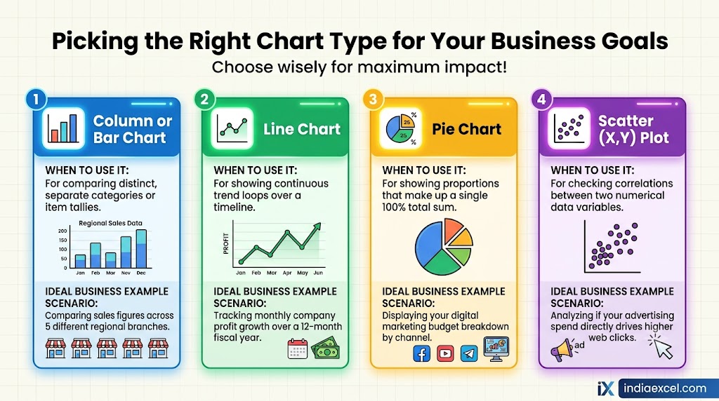
The Insert tab offers over a dozen styles. Choosing the wrong one can completely distort your presentation’s message:
| Chart Type icon | When to Use It | Ideal Business Example Scenario |
|---|---|---|
| Column or Bar Chart | For comparing distinct, separate categories or item tallies. | Comparing sales figures across 5 different regional branches. |
| Line Chart | For showing continuous continuous trend loops over a timeline. | Tracking monthly company profit growth over a 12-month fiscal year. |
| Pie Chart | For showing proportions that make up a single 100% total sum. | Displaying your digital marketing budget breakdown by channel. |
| Scatter (X,Y) Plot | For checking correlations between two numerical data variables. | Analyzing if your advertising spend directly drives higher web clicks. |
Pro Tip: The “Recommended Charts” Shortcut Hack
If you are unsure whether a Line graph or a Column chart will present your statistics better, use Excel’s built-in intelligence engine:
- Highlight your data summary block.
- Go to the Insert tab and click the large Recommended Charts button.
- Excel will analyze your specific numbers and display a custom popup menu previewing the top 4 visual formats that make the most logical sense for your exact layout structure.
- Select your favorite preview visual and click OK.
🛠️ Troubleshooting: Why is My Excel Chart Blank or Broken?
If you try to insert a chart and end up looking at a completely blank white box, check for these two common operational hiccups:
1. Your Numbers are Secretly Stored as Text Characters
If you copied your billing ledger from an external CRM (Customer Relationship Management) system or web platform, your numbers might be locked in a text formatting style. Because Excel cannot visually chart alphabetical letters, the graph fails to render.
- The Quick Fix: Highlight your data cells, look for the small yellow or green error warning icon on the side, and select “Convert to Number” to reload the chart lines.
2. The Data Row Filter is Hiding Your Cells
If your active worksheet is utilizing table data filters, your chart will dynamically hide any data points that are filtered out of view.
- The Quick Fix: Go to the Data tab, click Clear Filter, and watch your visual chart automatically redraw itself back to full scale.
❓ Frequently Asked Questions (FAQ)
How do I move a chart onto its own dedicated full-page sheet?
Click on your chart to select it. Look at the top of your Ribbon toolbar for the newly unlocked Chart Design context tab. Go all the way to the far-right side, click the Move Chart button, select New sheet, and hit OK.
See Next Post: How to Create a Pivot Table in Excel (Step-by-Step Data Summary)